Have you ever stepped into a room and felt a wave of emotions wash over you – be it a hospital, theatre, or even your living room? Well, this phenomenon has everything to do with the interplay of colours within the space you’re in (also known as colour psychology).
Colour psychology is pivotal in the interior design industry and understanding how it works is something that many industry experts have mastered. But being able to decode colour psychology isn’t just for the pros, anyone can do it! Keep reading to find out what colours evoke certain emotions and how you can use colour to create various atmospheres and moods within your home.
Shades of blue
When the colour blue comes to mind, you probably think of clear skies or the ocean, right? Both of these subconsciously influence a person’s mood because they’re affiliated with fond memories. So, when blue is utilised in interior design, it triggers a sense of calm, serenity, and relaxation, and even more so in the lighter shades. Darker hues evoke feelings of confidence, trust, loyalty, and dependability.
So, how to incorporate these into your space? Blue is best used in bedrooms and living spaces because you want these areas to feel calm and inviting. Use light shades of blue as a dominant colour in your bedroom by adding a blue coverlet to your bed or a pastel blue feature wall. When decorating your living room, we recommend using deeper shades of blue in various decorative accoutrements – think vases, artwork, and throw cushions.
Shades of green
Green is one of the more versatile colours and can be brought into almost every room in some way. Similarly to blue, green also evokes feelings of calmness because it has strong associations with nature. Green is thought to be tranquil and promotes growth, renewal, prosperity, and regeneration.
The best way to bring green into your space is through textural pieces like plants, rugs, and fabrics. Opt for statement furnishings in rich green velvets like dining chairs or sofas, add in a variety of foliage from hanging plants to petite succulents, and opt for contemporary Moroccan rugs with speckles of green throughout. The best part? Green can be added to any room within a house or apartment and even the most subtle additions can make all the difference.
Shades of red
Red can be a daunting colour to add to your space but it’s a real game changer! Red symbolises a range of emotions often depending on its intensity and contexts, but some common interpretation of the colour includes passion, energy, warmth, comfort, and creativity.
Shades of red are more suitable for kitchens where creativity is key. Ultimately red works best as an accent feature but be sure to balance with neutrals to prevent the space from becoming overwhelming. We also recommend creating a gradient by using various shades like maroon, burgundy, and rose instead of sticking to one stark shade only.
Shades of yellow
Radiant and cheerful, the colour yellow exudes warmth and sunshine which is why it’s often associated with youthfulness, energy, and fun.
Consider featuring yellow in nurseries or kids rooms because it is the ideal gender-neutral choice. When integrating yellow tones, it’s important to strike a balance where the shade is used in conjunction with other colours and design elements to create a harmonious environment. We recommend opting for a yellow ceiling accent or removable wall decals. For a more subtle yet impactful approach, add yellow fitted sheets to the bed to create a soft pop of colour in your bedding.
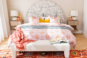
Shades of pink
To conclude, our final colour is pink – which is also the Pantone colour of the year, viva magenta! Pink has recently made a resurgence in interiors, especially dusty pinks which have been seen in a slew of Pinterest-worthy interiors. The shade often evokes romance, elegance, and harmony.
There’re so many ways to incorporate pink into your interiors but one of the best ways is through lighting. Look for pink-hued lamps, lampshades, or pendant lights to add a subtle glow of colour to your space. We also recommend introducing pink through bathroom accessories like towels, shower curtains, and bathmats.
As you decorate your home, keep in mind that colours do more than just look pretty – each colour can also help create the mood you want. So, whether you like calm blues, nature-inspired greens, bold reds, happy yellows, or elegant pinks, enjoy picking shades that resonate with you and the feelings you wish to welcome into your home.
Looking for more home inspiration? Join the Homemaker Collective to stay in the loop.
